Article: Mobile-Friendly Design for Canvas Courses

by Walter Milner, Instructional Designer IV, Learning and Educational Center
Today’s students are just like the rest of us – they use their phones for everything. And this includes accessing their courses, communicating with their professors and fellow students, and staying on top of grades and upcoming deadlines. Do you know how your course displays on a phone? Have you considered whether your course content can be accessed on one? Why are these questions important to consider?
Instructure’s Canvas, the Learning Management System (LMS) we use here at NSU, has an app available for both Android and Apple phones, that students and faculty can use to access courses and course communication tools. While we don’t know exactly how many students are using the app, or the details of when and how they do, Canvas has done some research (Kelly, 2020) which may give us a clue. They found that of the group surveyed, 87% of students were using the app, and 48% of them used it daily. What were they using it for? Grades, assignments, and announcements. These numbers were recorded before the Covid-19 pandemic, so it is possible they are even higher today.
Accessing courses on mobile devices offers students certain advantages. Primarily, the flexibility to stay connected and learn while on the go, without having to wait until they get home or somewhere they can log in on a computer to check in on their courses. 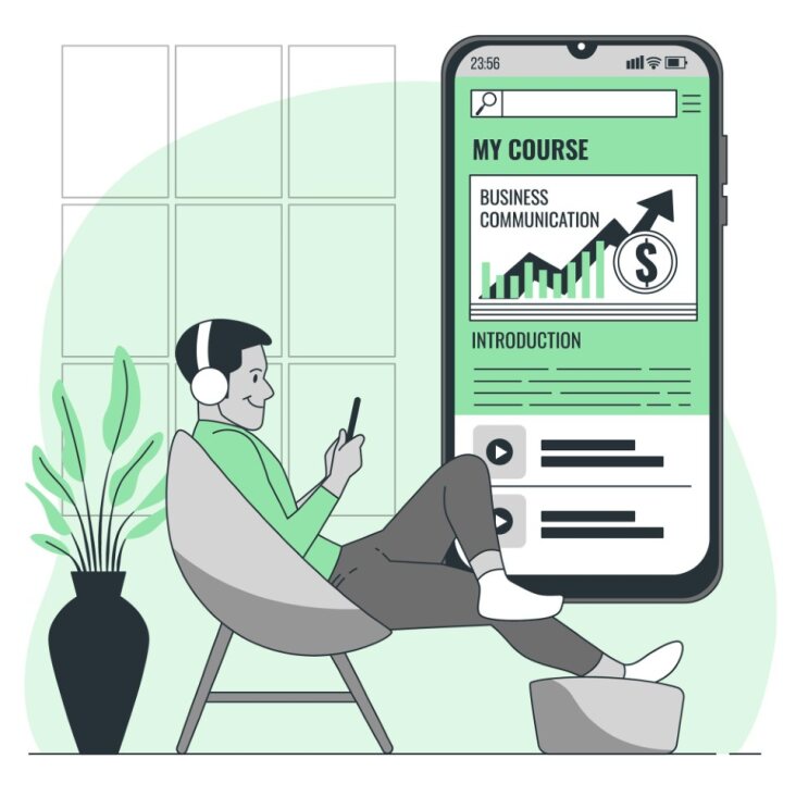 They can receive announcements immediately along with newly posted grades and feedback. Students can also access learning content wherever they are, and during breaks in their daily schedules when they may have a little time to do some schoolwork. For many students, their smartphone is their primary access device and for some students it may be their only way of accessing their courses. The advantage of flexibility allows students more control over when they learn and increases the chances of how often students log in to the LMS since they can log in at the time of their need (Pandey, 2018). Students also have the flexibility to begin work on one type of device, and then continue on another (Pandey, 2018).
When it comes to the Canvas app, for example, students say that they love being able to check in on their courses quickly and stay updated since they almost always have their phones on them (Kelly, 2020). Faculty also appreciate certain advantages of the mobile app. It helps them feel connected when they are not at a computer, respond to students, and make changes like extending due dates or correcting mistakes (Kelly, 2020).
Considering mobile-friendly design
If students are using their phones to access their courses, then it is worthwhile to think about how the design of courses translates to mobile mediums. If course content is not available on mobile devices, then it is not available to students who rely on their phones for access (Miller, n.d.). The physical characteristics of the device students are using, such as screen size, layout, and compatibility, should be considered to understand the requirements for appropriate course design (Curum & Khedo, 2020). To increase the effectiveness of mobile learning, it may be necessary to restructure learning content to avoid confusion and frustration that may discourage learners (Curum & Khedo, 2020).
Mobile-friendly design refers to the ability for content to be accessed and viewed properly on multiple types of devices, such as laptops and smartphones (Pandey, 2018). Some aspects of mobile-friendly design are more complex. Image size, for example, can sometimes be a challenge. Images may look very different depending on the device, displaying differently, or taking up different amounts of screen space depending on where they are viewed. Truly mobile-friendly design would require adaptive images, meaning that different versions of the image would have to be designed to display on correlating devices (Pandey, 2018). One thing that instructors can do in Canvas, is to use the “image options” menu to choose a percentage of screen size the image will take up, rather than a fixed pixel size. Another thing that could be done is to avoid very large images that take up a lot of screen space – especially tall images. If images have important details or text that students need to be able to see clearly, a link to the image can be provided for download when possible. While images may present complexities, there are many other areas of course design that faculty can consider in order to make their courses more mobile-friendly.
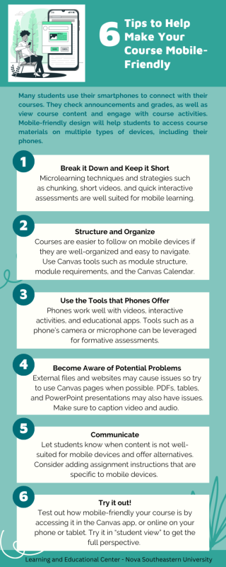
- Break it down and keep it short – Students accessing content on their phones will often be learning in small bursts when they have some time. One way to make content more mobile-friendly is to break down, or chunk, information into smaller sections (Philips, 2018; Pandey, 2018; Kelly, 2020). Microlearning techniques and strategies such as chunking, short videos, and quick interactive assessments are well-suited for mobile-based learning (Pandey, 2018; Kelly, 2020).
- Structure and organize – Courses are easier to follow on mobile devices if they are well-organized and easy to navigate. Use Canvas modules to break down learning content and activities as well as module requirements to keep students visually focused on where they are in the course and where to go next (Seilhamer et al., 2020). When relevant or possible, use a table of contents to organize learning material into sections that are easy to navigate (Kelly, 2020). Within Canvas pages, or uploaded documents, use headings (ex. H1, H2, H3) to separate sections of content and make them easy to read and more accessible (Miller, n.d.). (This is not the same as increasing font size for section headings. In terms of accessibility, for example, headings are recognized by screen readers and font size is not.) Other Canvas tools such as the Calendar and Announcements can be very useful to students on mobile devices to see reminders of upcoming deadlines. When creating assignments, including a due date will ensure that they show up in the Calendar, for example.
- Use the tools that phones offer – Phones work well with certain formats that can be included in course materials. These can be things like videos, interactive activities, and app-based activities that will resonate well with mobile users (Pandey, 2018). Smartphones also offer various tools that can be leveraged for coursework. Offering assignments that involve students using their phone’s camera or microphone is an example of this (Kelley, 2020). Another example is leveraging apps that can be used for educational purposes (Kelley, 2020) and tools such as Poll Everywhere that are mobile-friendly and can be used to create synchronous formative assessments and increase engagement with course content as well as with the instructor and fellow classmates.
- Become aware of potential problem areas – Some content and activities just won’t work well on a phone. Downloadable files and some websites may be difficult to view, for example. When possible, use Canvas pages for content rather than external sources (Seilhamer et al., 2020). PDF files are difficult to read on phones because the text is fixed and can’t adapt to the screen size (Miller, n.d.). Tables also don’t scale well on phones (Miller, n.d.). PowerPoint presentations may be difficult to view correctly as well. It is also notable that when students are using their mobile device to access courses, they are often on the go. With audio and video content, for example, they may not be able to hear the dialogue well where they are. For this reason – as well as for proper accessibility in general, it is good practice to include a transcript or captions that can be read.
- Communicate – Just because content may not be well-suited for smartphones, it doesn’t mean that it cannot be included in a course. Communication, however, will be helpful in these instances. Alert students when unsupported file types may be an issue, and offer alternatives (Seilhamer et al., 2020). If file sizes are large, you can let students know that they should connect to Wi-Fi before attempting to access them (Kelly, 2020). You may also want to consider adding assignment instructions that are specific to iOS and Android users on how to submit assignments on their mobile devices (Kelly, 2020).
- Try it out – The easiest way to know how your course displays on mobile devices is to try it. Look at your course in the Canvas app and online on your phone, or even on a tablet. You can do this in “student view” to get the full perspective. As you go through the course, if you encounter problem areas, consider how they can be resolved, or how you can communicate alternatives to your students.
Many students use their smartphones to access their courses. For some, it is their primary form of access – or their only one. If we can design course content with this in mind, it will help more students be successful, with less frustration and more effective learning. Additionally, the strategies suggested for mobile-friendly design are also Universal Design for Learning (UDL) strategies which are beneficial to students regardless of whether they are accessing courses on their computers or smartphones. Canvas tools, such as the Calendar and Announcements, will help students stay connected. Engaging content and microlearning techniques will help students who are learning in small bursts or who are easily distracted while on their phones (Kelley, 2020). Awareness of potential issues and good communication will also benefit students. These strategies should help students stay connected and be successful in one of their preferred styles – mobile.
If you would like to further explore mobile-friendly design for your courses, or have other course design needs, you can set up a time to meet one-on-one with an instructional designer through DesignLink.
The LEC also offers three mobile-friendly course templates that you can edit and use to build your courses. Information on the templates, along with guidance on how to import them can be found here: https://www.nova.edu/lec/New_LEC_Course_Templates.html
You can access a Canvas Mobile App Design Course Evaluation Checklist towards the bottom of the following webpage: Mobile App Design | Course Evaluation Checklist.
References
Curum, B., & Khedo, K. K. (2020). Cognitive load management in mobile learning systems: Principles and theories. Journal of Computers in Education, 8(1), 109–136. https://doi.org/10.1007/s40692-020-00173-6
Kelly, H. (2020, December 31). Mobile learning. To the power of canvas. Instructure. https://www.instructure.com/resources/blog/mobile-learning-power-canvas?filled
Miller, K. (n.d.). InstructureCon presentation. Retrieved December 8, 2023, from https://docs.google.com/presentation/d/124wW2QCpharLR6wNBViJpvn2NW_yVxW-xzyHi-yIOSs/edit#slide=id.p7
Pandey, A. (2018, May 7). Mobile first designs in eLearning: A mobile learning case study. ELearning Industry; eLearning Industry. https://elearningindustry.com/mobile-first-designs-in-elearning-mobile-learning-case-study
Philips, L. (2018, June 29). Mobile app design | Course evaluation checklist. Instructure Community. https://community.canvaslms.com/t5/Canvas-Instructional-Designer/Mobile-App-Design-Course-Evaluation-Checklist/ba-p/276877